An incredible journey
Message from the Managing Director

Behind the logo
The 20th year anniversary event logo is a powerful visual celebration of identity, heritage, and connection. At its centre is the steelpan, an iconic symbol of Trinidad and Tobago, representing creativity, resilience, and unity. Integrated within the steelpan design is the sitar, a nod to cultural diversity and the harmony of traditions that shape our society. Together, these instruments reflect the rich blend of influences that define both our nation and our firm, illustrating how diverse elements come together to create something truly extraordinary.
Encircled within the number 20, the design speaks to continuity, collaboration, and progress over two decades. The use of circular form conveys unity and forward movement, while the metallic gold accents symbolise excellence, achievement, and the value of experience gained over time. This logo is more than a visual marker of an anniversary; it is a tribute to our people, our shared culture, and the lasting impact created when local roots and global perspectives work in harmony.

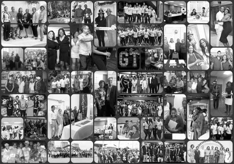
A look back at our 20th anniversary event


Our Local Impact
At Grant Thornton Trinidad and Tobago, our local impact is driven by a deep commitment to the communities we serve. We actively support charitable initiatives and community programmes that promote social development, inclusion, and opportunity. Through volunteerism, partnerships, and purposeful giving, our people contribute their time, skills, and resources to initiatives that create meaningful and lasting change beyond the workplace.
Our local impact is also reflected in how we invest in our people. Through clear career paths, professional development policies, and a supportive workplace culture, we empower individuals to grow, lead, and give back with confidence. By strengthening our people and supporting our communities, we contribute to a more resilient and sustainable future for Trinidad and Tobago.

Going beyond the office
We are committed to being an active and responsible member of the communities in which we live and work.

Services
Partnering with us means working with a firm that combines deep regional knowledge with the strength and insight of a global network.

Life at Grant Thornton
Joining Grant Thornton means becoming part of a dynamic global network of more than 80,000 professionals across over 150 markets.